- Adapting the corporate design to the parent company technotrans SE
- Use of synergy effects
- New logo symbolizes the perfect balance
Technical Documentation, Software Solutions, Risk Assessment, CE Marking, Technical Translation: In product development, a competent partner for technical communication can provide support in various fields of action along the value chain. With a portfolio that is unique in the industry, the gds group can support its customers holistically in the development process, therefore minimizing friction losses and increasing efficiency. As a result, the company is now positioning itself as a leading competence center for technical communication and information management. In line with this, the corporate design is also changing to match technotrans SE, which also brings gds visually closer to the parent company. This strong partnership and the resulting synergy effects are therefore clearly emphasized by a uniform image to the outside world.
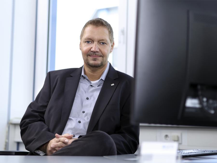
“Our repositioning strengthens our ties to our parent company, technotrans SE,” says Ulrich Pelster, Managing Director of gds GmbH. Under the technotrans motto “We transform the future,” the goal is always the development of new ideas and innovations to provide the best possible support for customers. This naturally also applies to technical communication and information management throughout the entire product development process. “As a product should not only be functional and look appealing, but also offer safe use, we are available to our customers as soon as the project starts, if required.”
During the initial phase, the competence center primarily considers risk and compliance issues. The accompanying preparation of technical documentation and professional technical translation – human, hybrid or machine – into all relevant target languages round off the range of services offered by the gds Group. This means that all services and products can be used individually and independently as well as holistically throughout the entire development process.
In line with the company’s repositioning, the external appearance of the gds Group is also changing to emphasize its proximity to the parent company technotrans SE, which developed a new logo and redesigned its website as part of its modernization and focus on the future. The new logo, two interconnecting geometric circles, is a symbol of the perfect balance, representing not only the potential for profitable transformation, but also the balance between humankind and its environment.
In close dialog with customers and partners
As a competence center that accompanies customers holistically, gds enters into close exchange and dialog with its customers and partners, made visible by the interconnection between the logo's circles. Throughout the entire process, gds uses its specific competencies to help steer projects, provide impetus on conformity issues, and ultimately close the circle with complete technical documentation including technical translation and the required software solutions. All this serves to lead to perfect balance, symbolized by the equal size of the circles. To achieve this balance while being able to offer its customers the ideal solutions, gds is constantly developing. Accordingly, the logo is also reminiscent of the infinity sign (∞).
In addition to the new logo, gds, together with the parent company, is now focusing on a new, distinctive color spectrum with bold and vibrant tones. Another design element is the Transformation Grid, a flexible grid of points that is subject to constant change and therefore represents movement and dynamics. “The Transformation Grid acts as a symbol of the flexibility and adaptability to customer needs that have always characterized gds,” says Ulrich Pelster. “So, this element fits in perfectly with how we see ourselves.”
